How Improving Fintech Subscription Management Tools Increases User Engagement
Americans underestimate their spending by almost 114%, according to CNBC in 2020.
The unaccounted for charges from forgotten subscriptions, auto-renewals, and expired free trials count for hundreds to thousands of dollars extra expense each year.
68% of Americans have reported being more budget conscious, looking actively for ways to reduce their spending since the pandemic, to counteract the uncertainty during these challenging economic times .
Current App Offerings Don’t Address Key User Concerns: Convenience, Ease-of-use and Savings
There are a plethora of online apps like TruBill, Trim, Subby, Bobby and Alfred who aim to help users track subscriptions and cancel unwanted costs.
What companies are doing right:
Subscription trackers allow users to connect their bank accounts automatically in some instances, or else input their charges manually
Some send automatic reminders of upcoming payments
Premium memberships offer to cancel recurring charges.
Some also offer to negotiate prices with companies.
What the competition gets wrong:
While some address one or two user concerns, the added features and convoluted user journeys create a convoluted experience for the user, diminishing the apps value, bombarding with bells and whistles, making it less competitive because it detracts from overarching value.
Adding charges manually is a time-consuming hassle that results in users abandoning the service before reaping the benefits of the product.
Users are looking for savings, convenience, and protection against the consequences of overspending.
In our study, users were looking for ways to lower their risk of overspending, discard services they don’t use and saving money. Yet the current offerings on the table, require them to go through every transaction which is counterintuitive.
Users are looking for a way to save money, lower their risk for paying fees for services they don’t use, and convenience. They want transparency in their spending, without spending time going over every transaction on their phone or bank account.
Meet Jen
Jen is a 30-something professional who subscribes to a multitude of apps and services. One day she wakes up with a notification for an overdraft charge from her bank. Surprised, Jen realizes that she has been overpaying for services she doesn’t even use, racking up hundreds of dollars she hadn’t budgeted for.
How might we help Jen save money automatically so that she feels confident and in control of her budget?
We identified two primary scenarios for Jen when connecting to our app:
Jen decides to sign up to our tracking service in an attempt to rein in her spending and get a handle on where her dollars are going so this unpleasant experience doesn’t catch her off guard again.
Jen wants to manage her subscriptions and/or automatically cancel unused services with a way to opt-out.
The Experiment: Testing Current App Features
We decided to move quickly from mock-ups to a mid-fidelity prototype in order to test our key hypothesis efficiently while respecting tight deadlines. Our aim was to concentrate on solving the following issues:
Jen Needs Automated Savings to Reach Her Goals
Research shows that despite current reminders on apps and banking websites, Americans like Jen are still overspending on recurring subscriptions and rollover charges. What could we do to disrupt this system and create savings without user input?
Cumbersome UI Reduces Retention
Linking bank accounts or manually adding in charges takes a lot of time, and keeping up with dashboard inputs and analyzing spending each month takes more dedication than users like Jen normally have to spend. What steps can we take to simplify this process?
Mid-fidelity Testing Identifies Extraneous Features
In the first mid-fidelity designs, we worked on fleshing out the red routes, asking users to test the following:
Dashboard
A main dashboard page with personalized banking information
Bill Section
A calendar view and “view all” page that shows upcoming bills and past cancellations
Subscriptions
Subscription pages offering more detail on the bill, past payments, and cancellation options
Will users accept the auto-cancellation feature?
We conducted remote usability testing via Zoom in order to answer our most pressing question: would a feature that automatically cancels unused apps and services be accepted by the user?
While enthusiastic about the concept of auto-cancellation, Jen struggled with the homepage and some key navigation, inspiring us to reimagine the initial experience.
Design Updates Remove Confusing Features
Following our initial usability tests, we synthesized the data in order to pinpoint the moments where users were lost, ultimately streamlining the homepage dashboard and bottom navigation, creating two distinct paths to view and manage subscriptions for Jen.
Recurring Charges Page
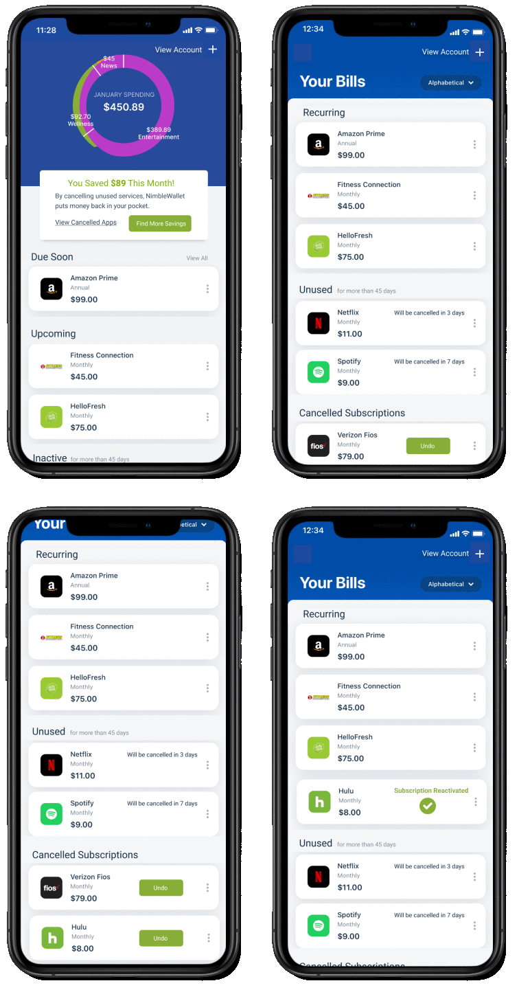
Jen can easily navigate from the home page to view and edit all bills at a glance.
Product Subscription Page
An in-depth look at older and upcoming payments available on the product subscription page, as well as the ability to edit subscription.

How Removing Superfluous Features Increased Navigation
Paring down the features in order to clean up the homepage and remove the little-understood bottom navigation distilled the experience by removing nonessential UI that added unnecessary confusion to the user journey. Now Jen is able to easily find her way through the app.
Jen can manage her subscriptions with ease from the Recurring Bills list.
Subscribers like Jen are engaged and enjoy peace of mind, free from worrying about unexpected overdraft charges.
The abundance of hesitation and confusion from too much UI, especially on the dashboard homepage, threatened to overshadow the helpful features of our product.
After paring down the UI elements and features, a second round of testing showed major improvements in navigation and comprehension of the key functionalities of the app; however, further improvements could be made in improving the account pages, calendar view, and process to add a new bill.
For now, we are confident that the pared-down version of the app, with its clear design and helpful automatic cancellation feature, will both engage new users and retain returning subscribers.


